Dark mode in CSS
Adding dark mode support to websites has become incredibly simple. Plenty of guides and walk-throughs have been written on the topic, so I'm not covering new ground here (I especially appreciated this guide (opens new window) by Adhuham (opens new window)). It only took me a few minutes, but I still wanted to document my steps here.
Considerations 🔗
Dark mode support should be a consideration at the design stage of most products today. It may be a backlog item for awhile, but it needs to be at least in the back of designers' & developers' minds when building a product.
When coming up with the initial design for my site, I didn't want to spend much time picking colors and finding the right contrasts for accessibility. I went with just black and white colors and simple fonts, with the hopes that the design would reflect the technical nature of the content. This overly simple color usage made adding theme support incredibly simple. This likely won't be the case for most sites, but it's something to consider when deciding on a color pallette.
It's getting dark in here 🔗
The first step to enabling theme toggling was to set the color-scheme (opens new window) in my site's styles, and that got me way farther than I expected!
:root {
  color-scheme: light dark;
}
It's also good to add the color-scheme meta tag to your site's <head> to tell the browser what themes are available. Since I use Vuepress to build this site, I added this to my site theme's config.js file (opens new window).

With just that color-scheme CSS change, every element's color that I didn't explicitly set in CSS did what it should do when going from light mode to dark mode. The next step was to get the color values that I did specify in CSS correctly updated when toggling light/dark theme. I didn't want to go with the class="dark" approach on the body, since that requires more verbose stylesheets. With CSS variable browser support (opens new window) being so great now, going with a pure CSS approach was the obvious choice and most performant (since it requires no JavaScript).
CSS variables 🔗
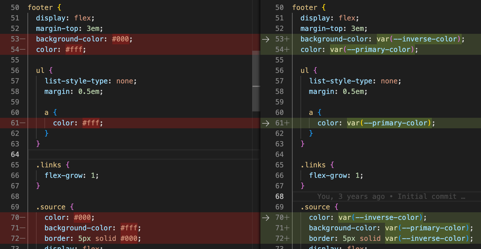
All I needed were two variables since this site is just black and white. Naming color variables that have dynamic values can be difficult, but I went with primary-color and inverse-color. When in light mode, primary-color is white (#fff) and in dark mode primary-color is black (#000). The default style is the light theme.
:root {
  color-scheme: light dark;
  --primary-color: #fff;
  --inverse-color: #000;
}
When the user has an operating system currently in dark mode, those default values are updated. This is done through the prefers-color-scheme media query (opens new window).
@media (prefers-color-scheme: dark) {
  :root {
    --primary-color: #000;
    --inverse-color: #fff;
  }
}
Once the CSS variable values were being set correctly, it was just a matter of updating styles to use them instead of hard-coded color values.
Ship it 🔗
Adding this feature to my site was the software engineer's dream scenario that rarely happens: a few lines of code and everything just works.

About Me
Hi, I'm Dominic 👋 I'm a software engineer building front-end web apps, back-end services, and some things in between. I most enjoy working with TypeScript and .NET (6+/Core). Check out some of my projects, or get in touch.